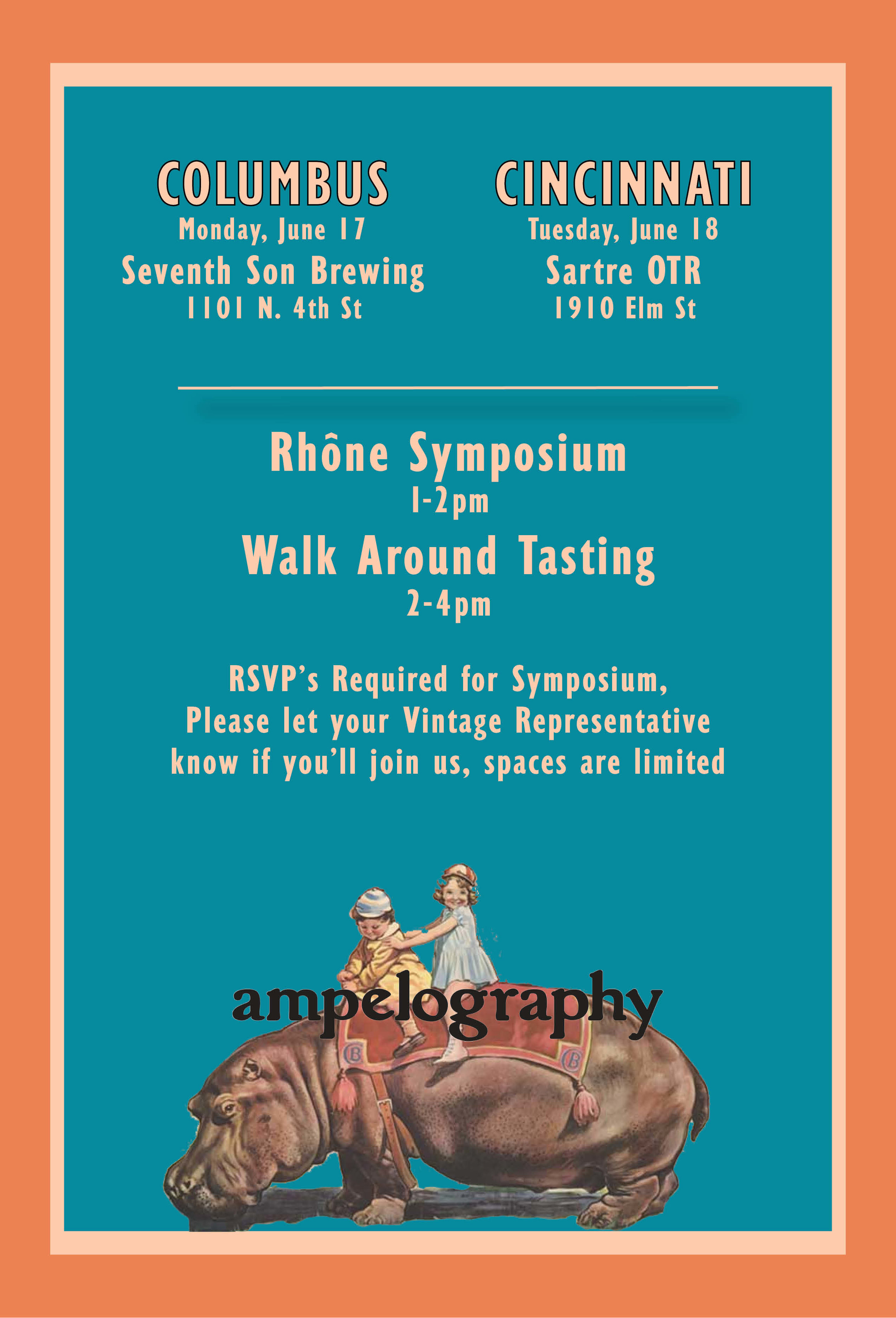
When the idea came about, of a road show, with 3 decidedly large personalities…we discussed the level of potential chaos, that could ensue. PART of the chaos, ostensibly, would be surrounded by the enthusiasm of buyers throughout the state. Another component, is the juggling of these, specific and complex events. THUS, the circus.
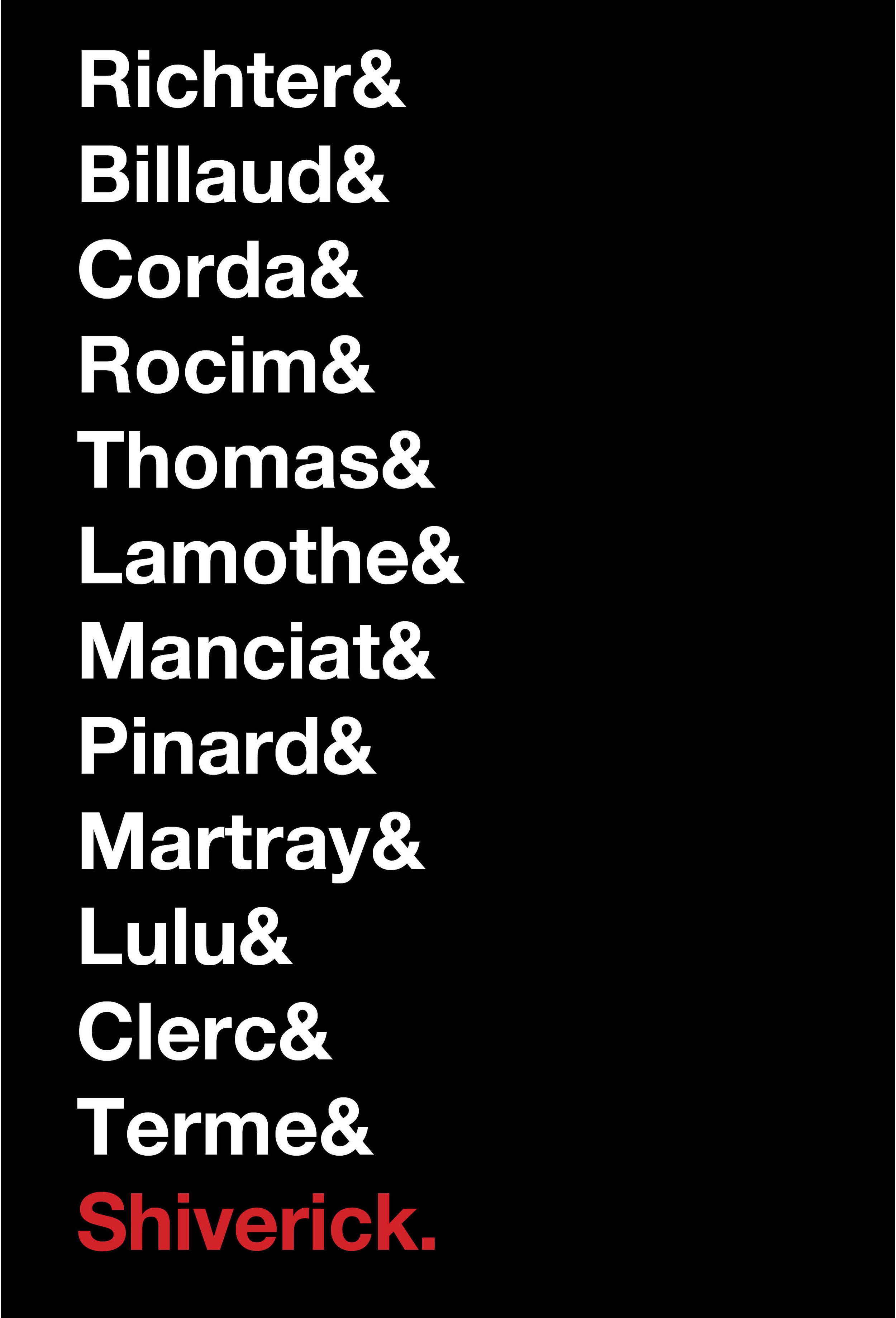
Shiverick/ Tenzing Show-Chicago 2019
Conceptually, this has been done, often, perhaps ad nauseum. Regardless, it felt apropos to list the murderer’s row of great wineries.

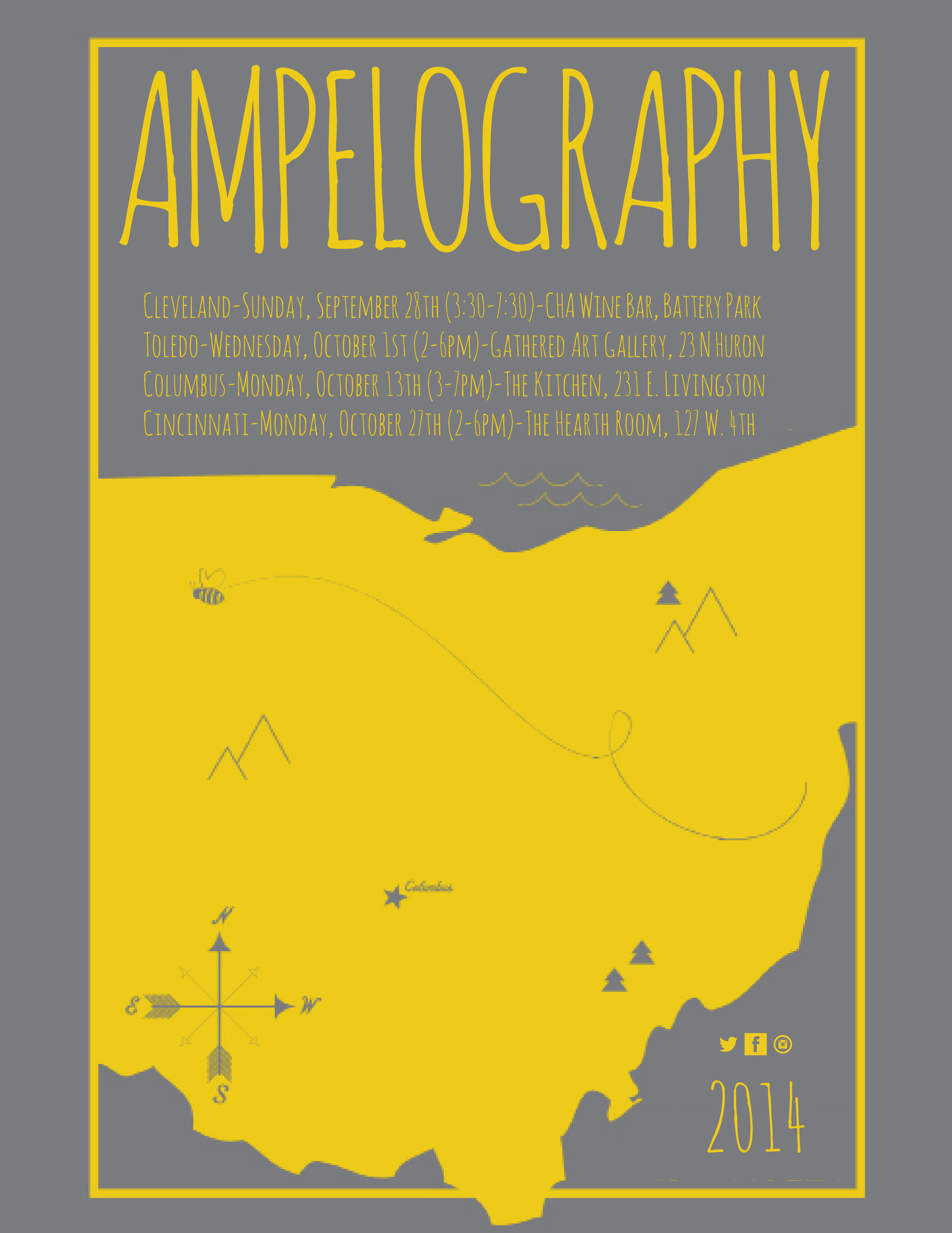
2014 Ohio Trade Show invites
The National is an acclaimed band from Cincinnati. This is stolen directly from a fan art piece for the eponymous single "Bloodbuzz Ohio". Credit to Katie at Consequence of Color
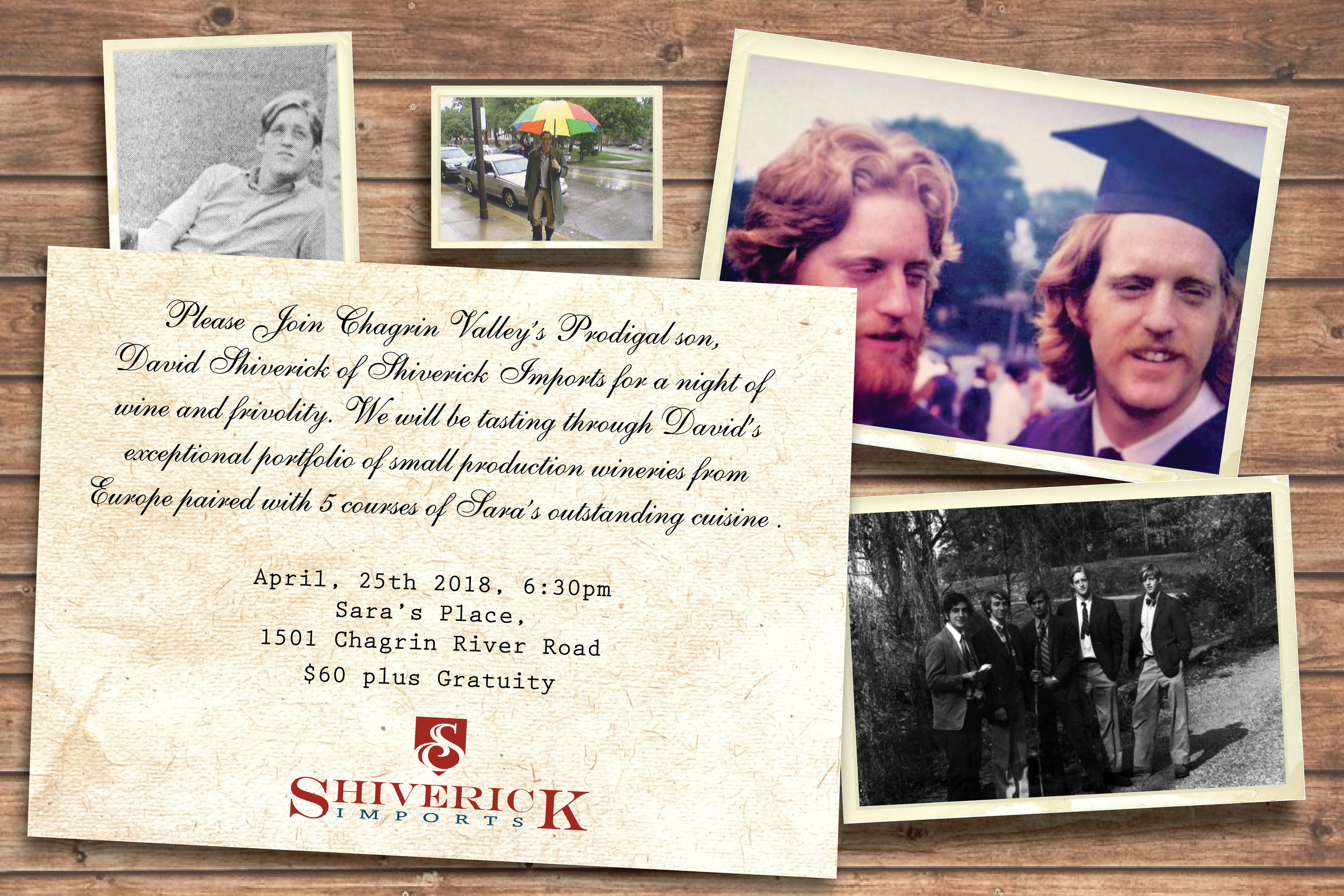
When give the title-The Prodigal son returns, I thought about what that would look like-mostly, old pictures on the wall, pretending that this person hadn't been back in 30 years (in reality, he had been back often). A little FB stalking, and I was able to come up with great old photos of David, et Voila!
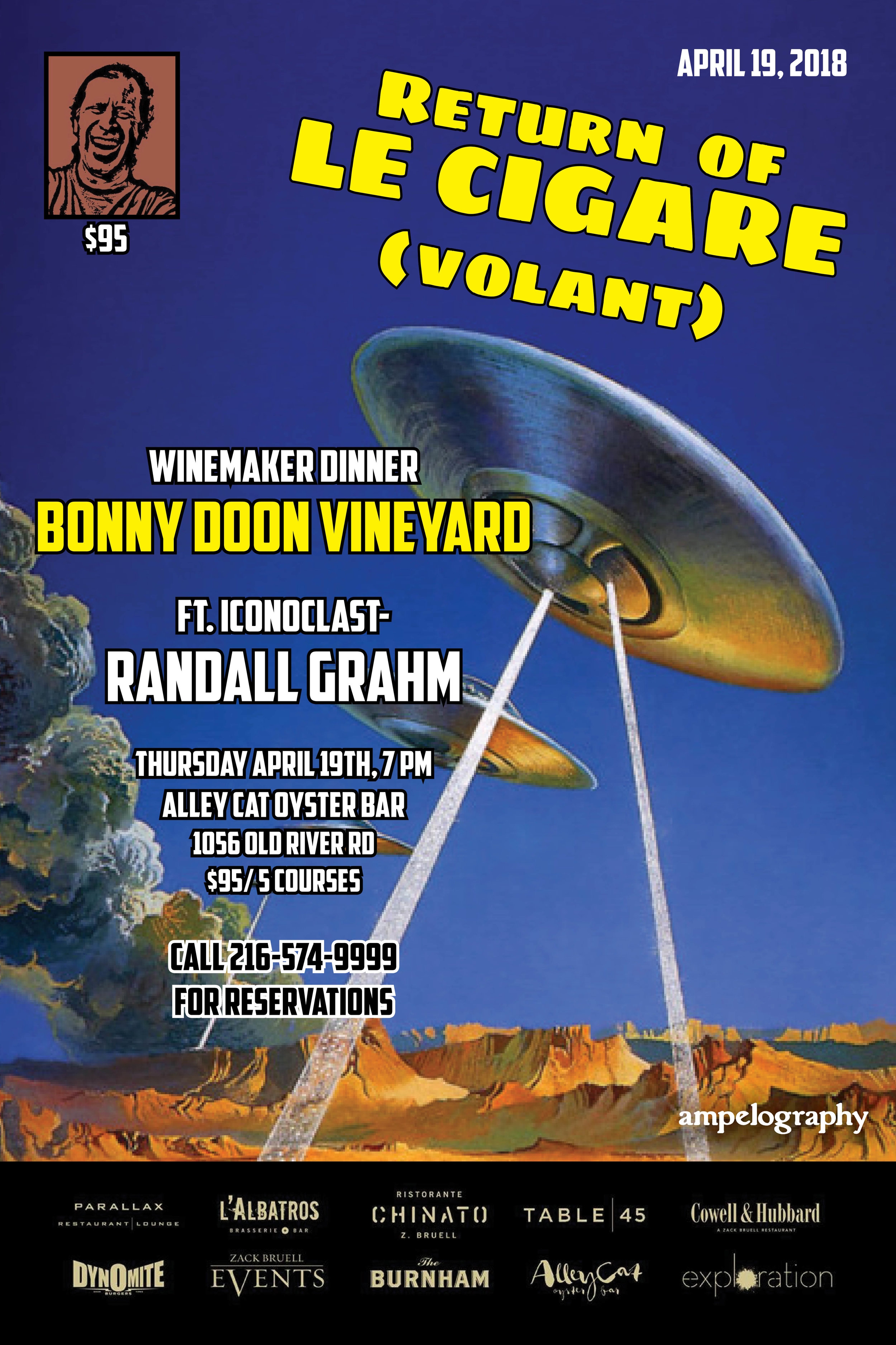
Bonny Doon often evokes the whole UFO thing (thanks to Cigare Volant). I really like the old "pulp" magazines and comics, that era really leaned into the whole alien panic. Made for a fun piece.
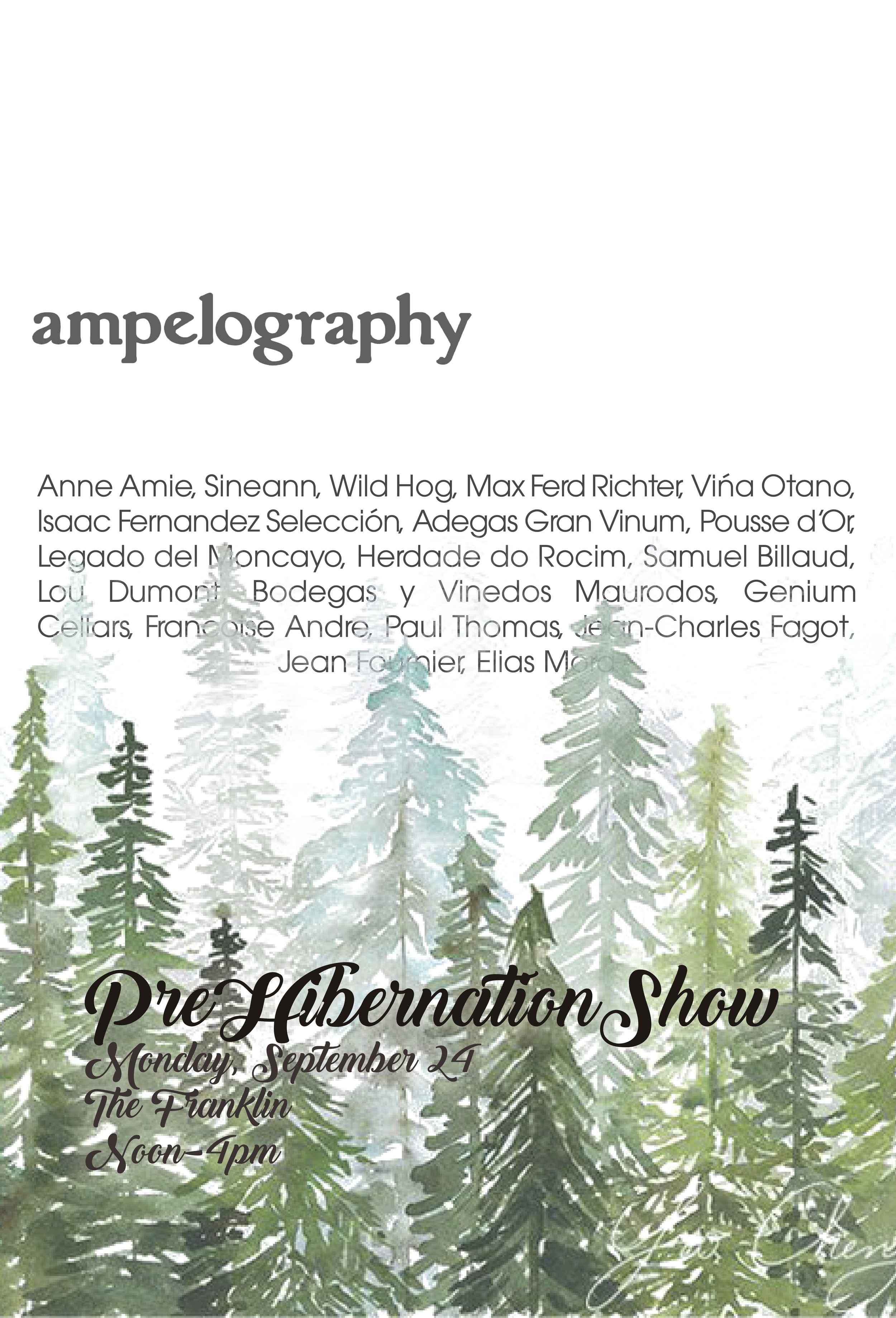
I loved the idea of Traverse City starting to hunker down for winter after a long and busy summer season. Whenever I go up there, I’m struck by how the trees shift to almost exclusively conifers as you go North.
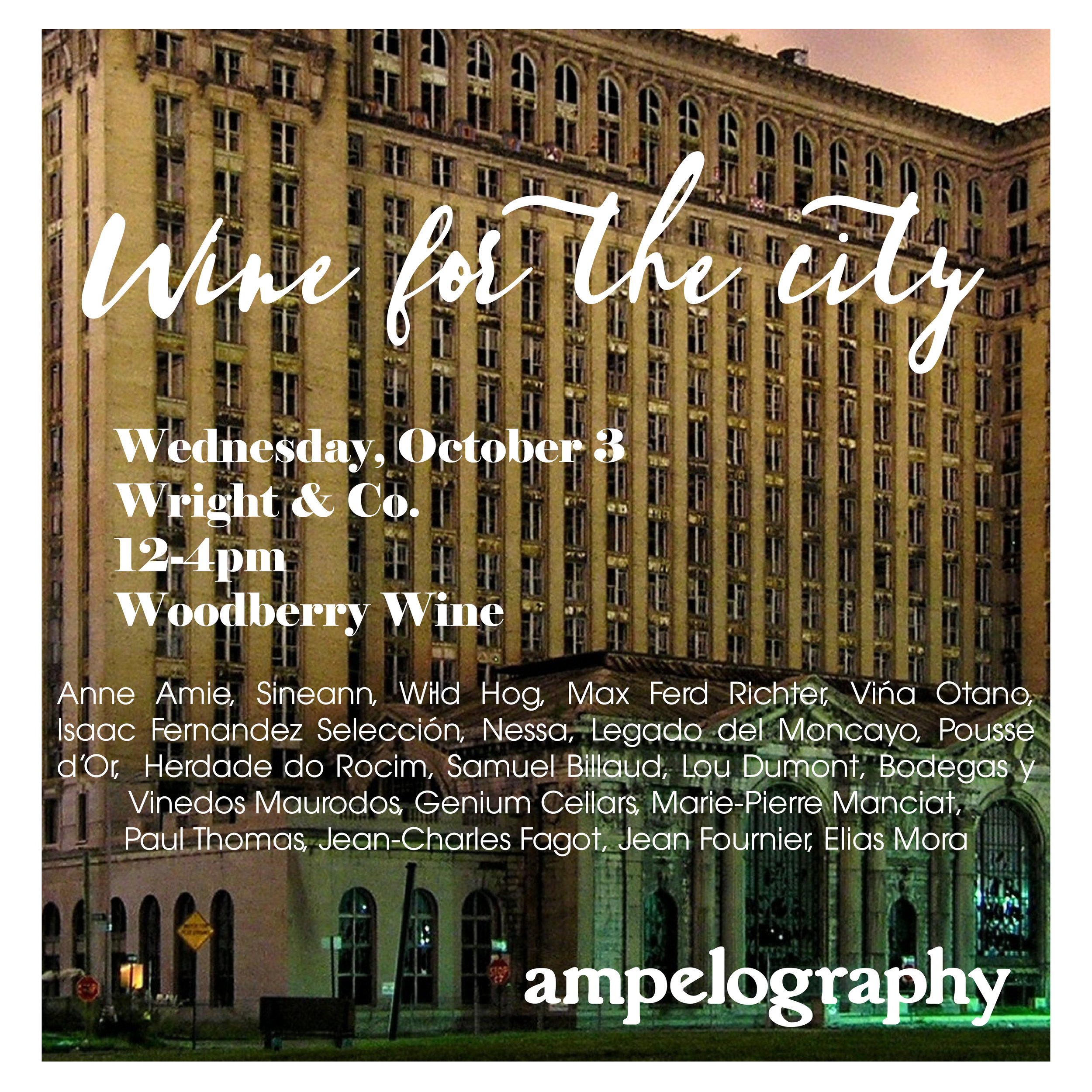
An emerging Detroit, this iconic building, the old Michigan Transit Station, laid in disrepair my entire life. Blasted out windows, were the “welcome to Detroit” sign of my youth. Now, fully embraced and the future home of Ford, this is a great symbol of the City’s resurgence.I loved the lighting of this photograph. Played well as a backdrop.
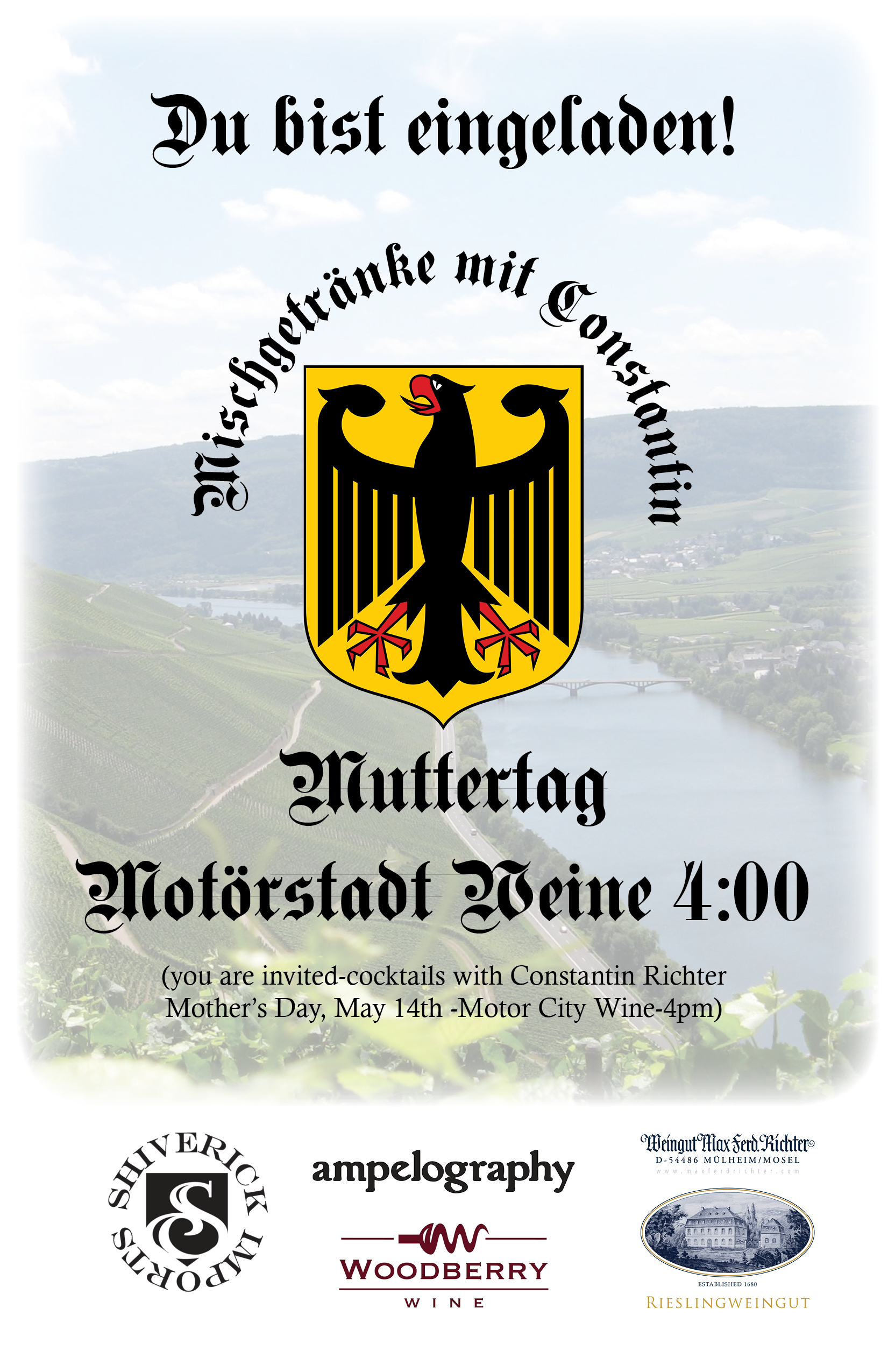
Constantin Richter Michigan Visits
Germans have a reputation for being intense and serious. I liked the juxtaposition, becuase this was an incredibly casual event with a very laid back winemaker.
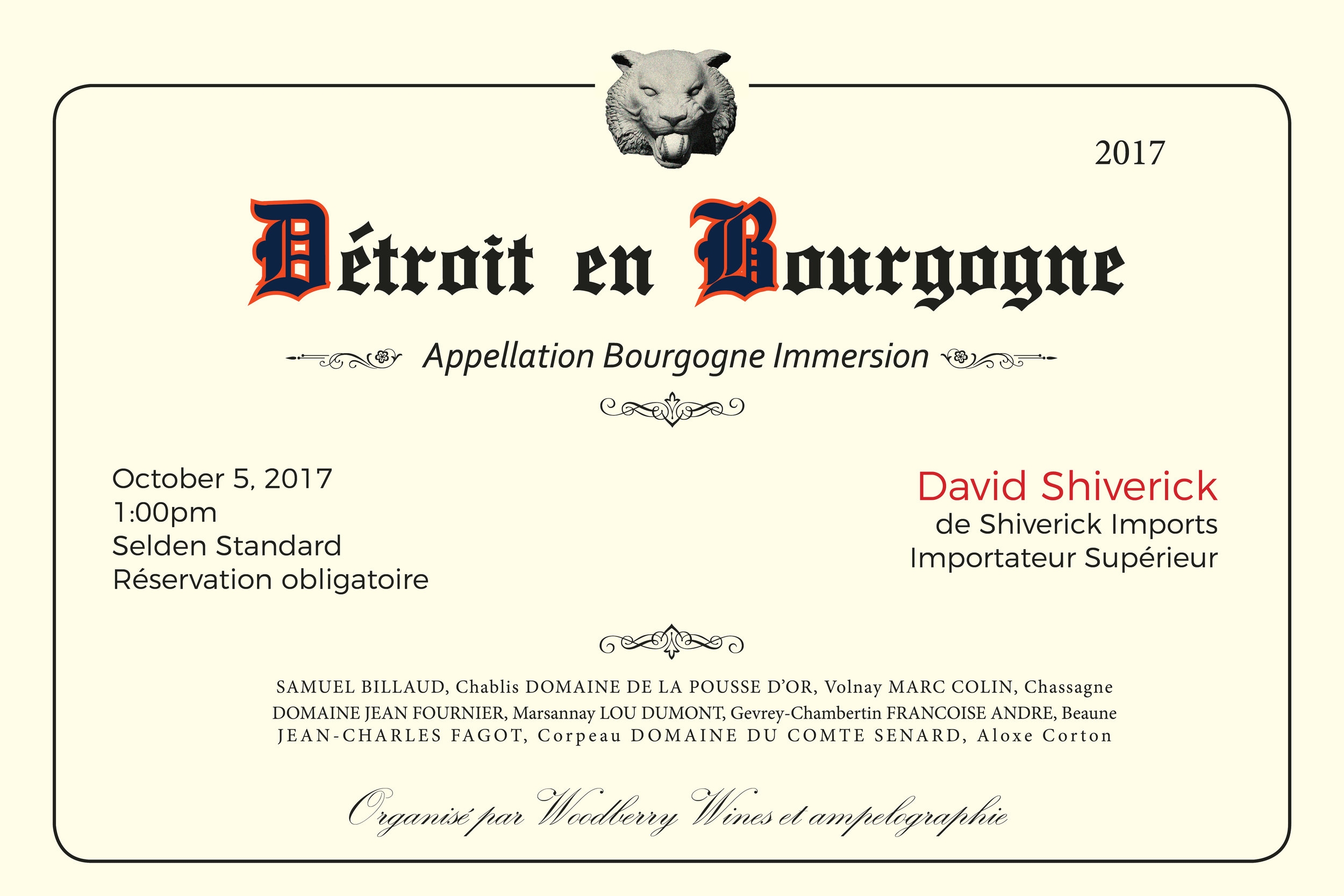
Detroit en Bourgogne
An trade invite for a Burgundy seminar, hosted by David Shiverick. I tried to incorporate traditional elements from a Burgundy label, with Detroit flourishes. The classic old English lettering, played perfectly into the Detroit Tigers theme, I was able to utilize one of the actual fonts for the Detroit Tigers, along with their colors and a gargoyle from Comerica Park. The name of translates into French-"Straight up Burgundy".
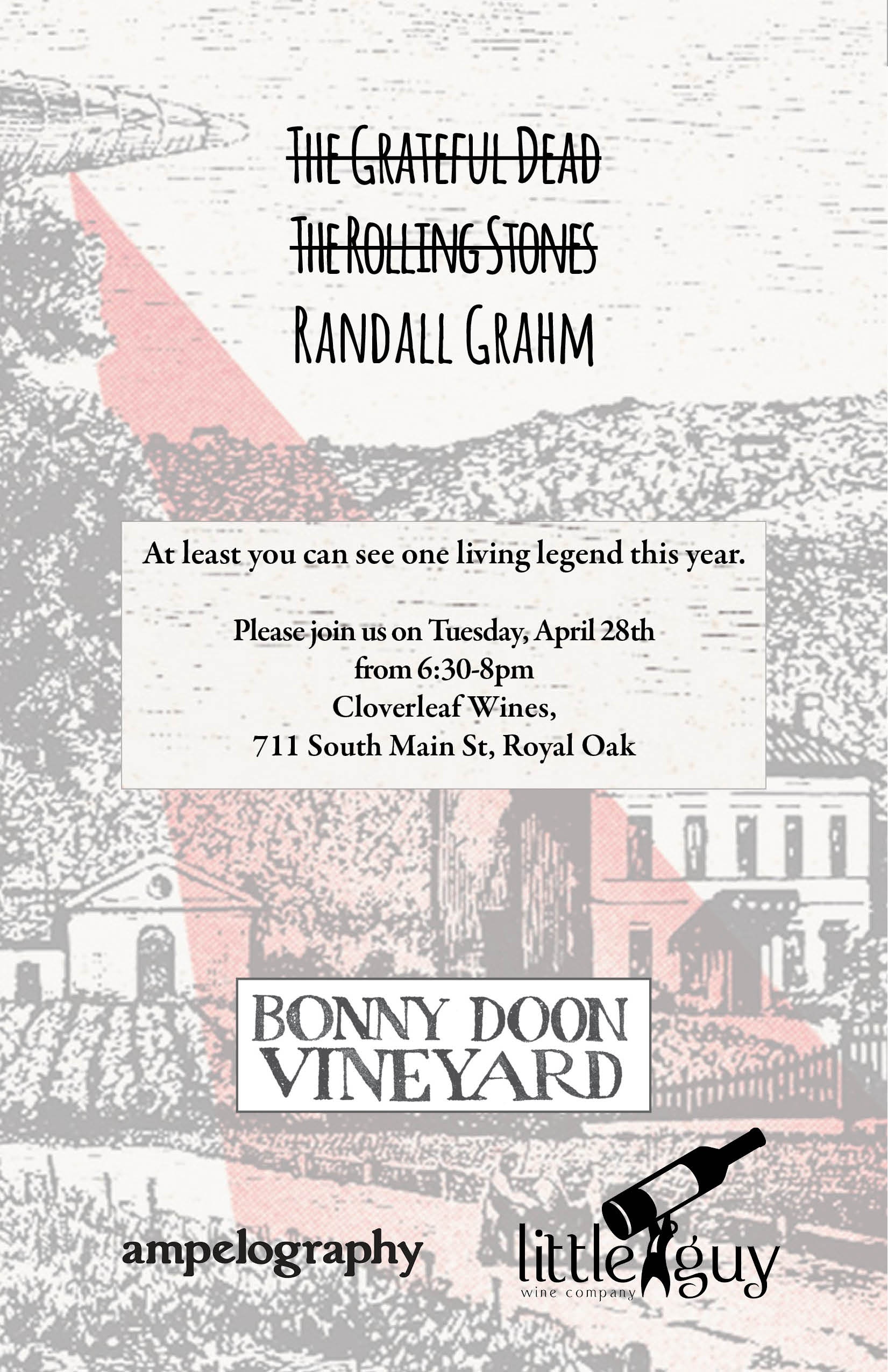
2015 Randall Grahm Michigan visit
Randall is a rock star. That year, The Grateful Dead and The Rolling Stones both performed for (maybe) the last times. The tickets were impossible to get your hands on. This all felt like it went together-Side note-I attended 2 of the final 3 Dead Shows.

The Return of the Rooster
One of my first original design attempts. I still like the simplicity.

Grapes and Grain Dinner
Playing with designs from the early 20th century

Hootenanny-back
Once again, stolen directly from album art. This, for me,was a direct manipulation of the iconic REPLACEMENTS collection form the 80's-Hootenanny. Unbeknownst to me, they lifted it themselves from a folk compilation from the 60's. What goes around, comes around, I suppose. I loved the ability to plug a bunch of terms into the boxes.
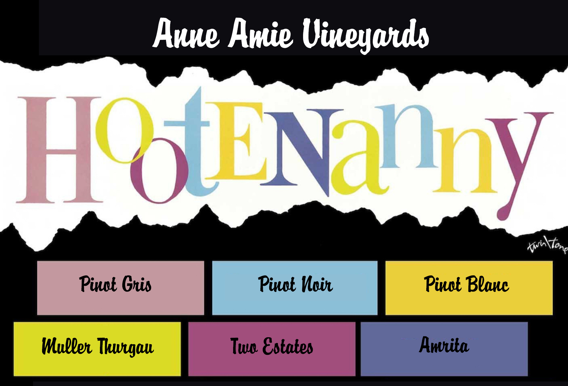
Hootenanny-Front
Once again, stolen directly from album art. This, for me,was a direct manipulation of the iconic REPLACEMENTS collection form the 80's-Hootenanny. Unbeknownst to me, they lifted it themselves from a folk compilation from the 60's. What goes around, comes around, I suppose. I loved the ability to plug a bunch of terms into the boxes.
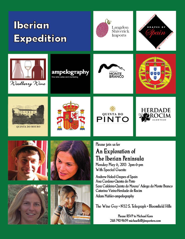
Iberian Peninsula Shows
so many differing logos (3 wineries, 2 importers, 1 distributor) all needing equal space. This event was around the time of the short lived Windows Phones. You may recall the "tile" concept. This was inspired by that.
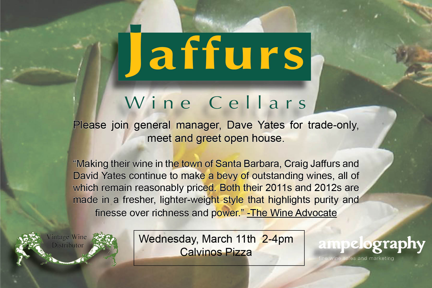
Jaffurs Trade Tasting
One of a few attempts at integrating pretty cool photography into the invite. This is a Matilija Daisy, which is the flower on the label of Jaffurs. Really, only found in the area around Santa Barbara, I though this broght some cool authenticity.
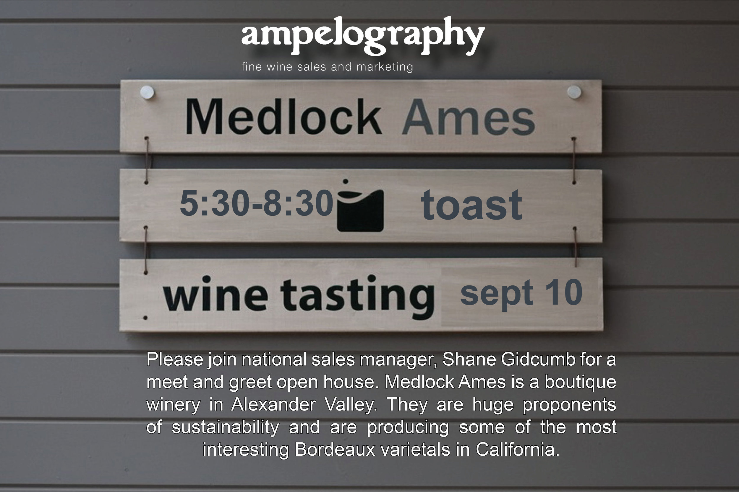
Medlock Ames Trade Tasting
Another usage of actual photography. I liked this, because this IS the sign to their tasting room. Decent design, I need to work on my photoshop skills...
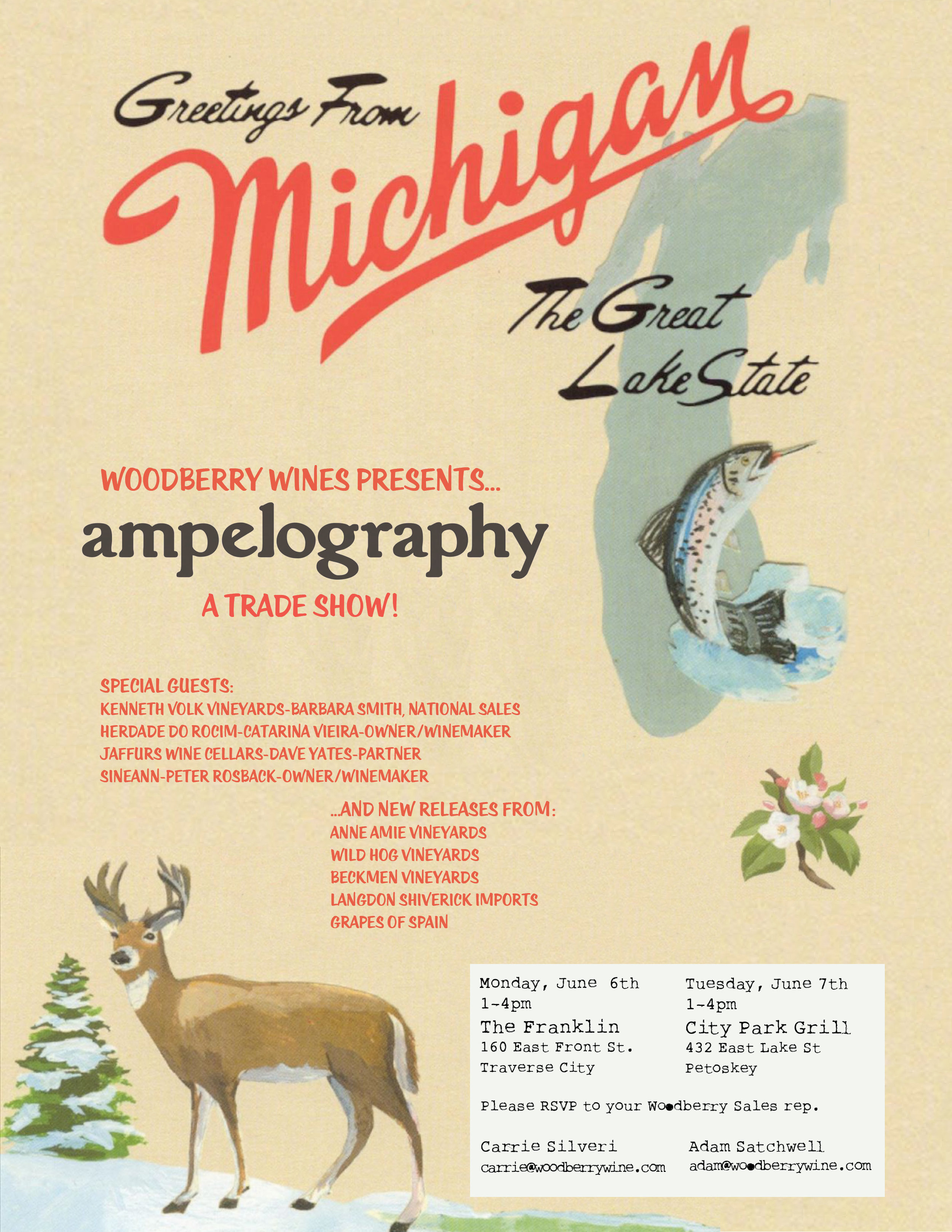
Greetings from Michigan-Trade Shows
ANOTHER stolen album art.This time from Sufjan Stevens. This art made me think of Northern Michigan (which is where these shows took place). The outdoors/ lodge theme is everywhere, even though, it's really the playground of the well-heeled. The locals didn't love the design, but it remains one of my favorites. Credit to Laura Normandin,

Fete d Ete
This design has evolved, and will probably continue to evolve. Locally (Toledo, Ohio), there is a group called Toledo Pub Riders. They have a design, later found out to be the Fat Tire Logo. I "borrowed" that logo and asked to plants roots coming off the tires, to dually signify city roots and vines. This was for a progressive wine dinner on bicycle. I asked the company that made our shirts, to modify the logo, so as to not steal from another beverage company. This piece is the latest color variation, which we hoped to emulate the colors of a watermelon (Summer). It looks better on a shirt, I'm sort of lukewarm on this and am ready to switch it up
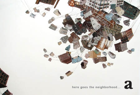
ampelography kickoff show
When I began ampelography, I had a partner. He was very enthusiastic about the Tremont neighborhood of Cleveland. we hosted this kickoff in a gallery in that neighborhood. This art is from a trememdous artist by the name of Amy Casey, the piece is called "Tangled"

